Work Collection
Rowlands Flu Campaign Re-design


Overview
Overview
Overview
Rowlands Pharmaceuticals' flu campaign aims to promote flu vaccinations and raise awareness about their importance. Through a combination of informative posters, brochures, social media campaigns, and targeted email newsletters, the campaign encourages individuals to take proactive steps to protect their health during the flu season.
Rowlands Pharmaceuticals' flu campaign aims to promote flu vaccinations and raise awareness about their importance. Through a combination of informative posters, brochures, social media campaigns, and targeted email newsletters, the campaign encourages individuals to take proactive steps to protect their health during the flu season.
Rowlands Pharmaceuticals' flu campaign aims to promote flu vaccinations and raise awareness about their importance. Through a combination of informative posters, brochures, social media campaigns, and targeted email newsletters, the campaign encourages individuals to take proactive steps to protect their health during the flu season.
Approach
Approach
Approach
In my role as a designer, I had the opportunity to undertake the redesign of Rowlands Pharmaceuticals' flu campaign. The goal of this campaign was to increase awareness about flu vaccinations and encourage customers to take action. My design work encompassed various materials, including posters, shelf talkers, strut cards, bunting, and stickers that were to be distributed to all pharmacies.
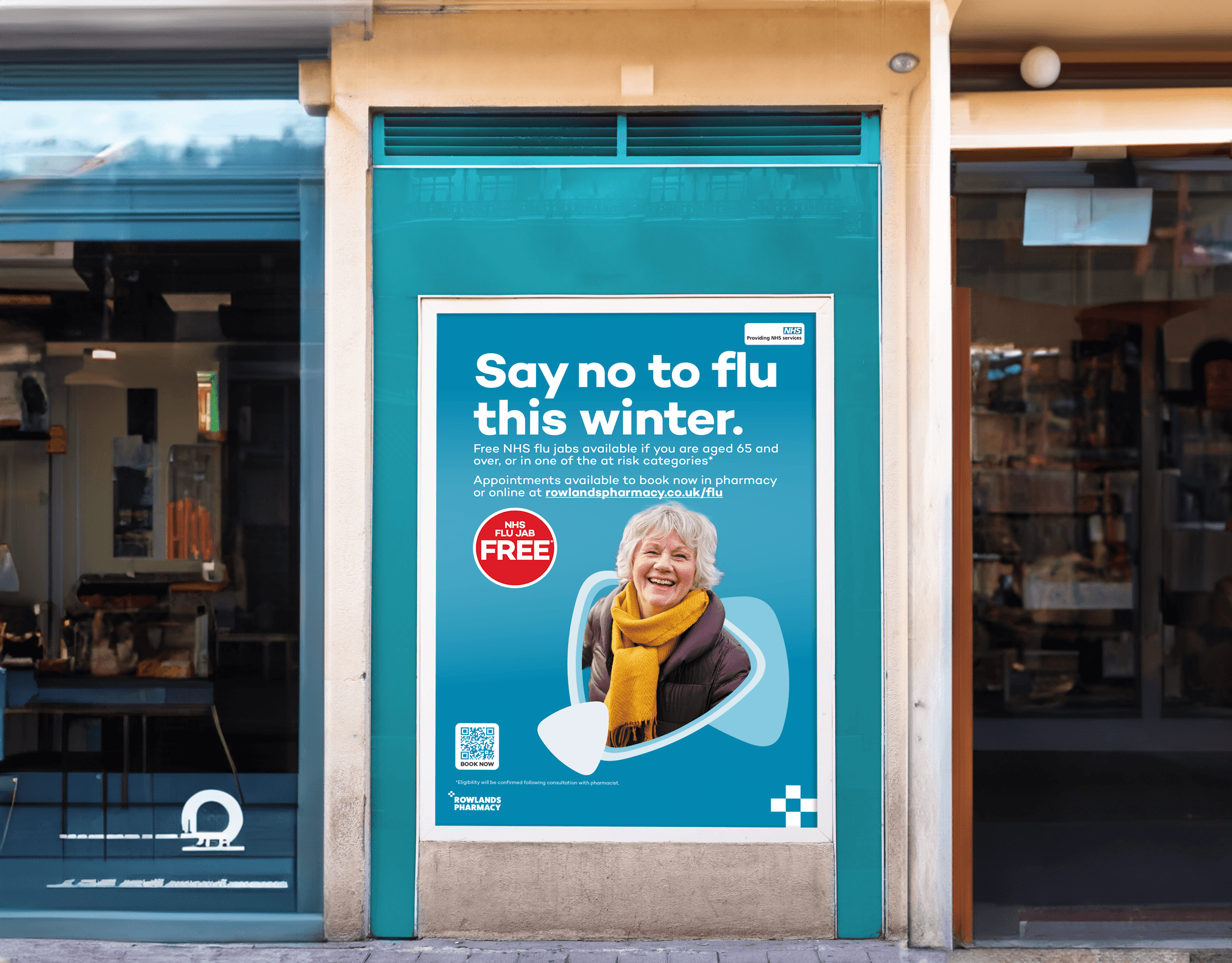
For the posters, I focused on creating visually striking designs that would catch the attention of customers. These posters displayed compelling visuals and persuasive messaging to emphasize the importance of flu vaccinations. Clear and concise information was presented, guiding customers on how to obtain the vaccine.
To further promote the campaign within the pharmacies, I designed eye-catching shelf talkers. These small signage pieces were strategically placed on shelves, capturing the interest of customers and directing their attention towards the availability of flu vaccines. Engaging graphics and concise text were utilized to highlight the key benefits of getting vaccinated, encouraging customers to inquire further.
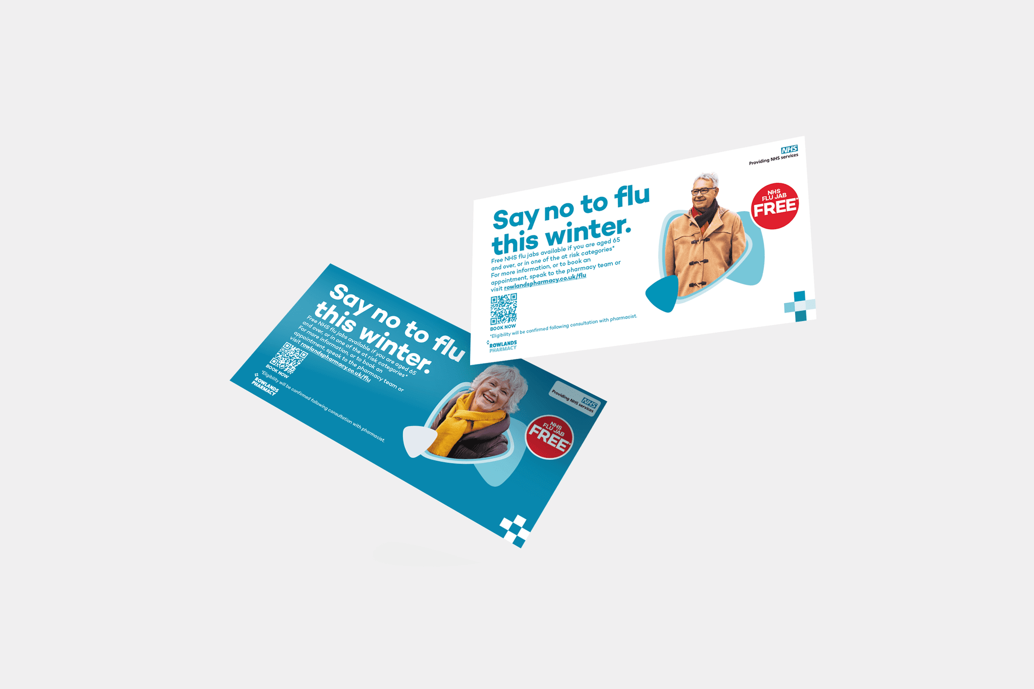
Additionally, I created attractive strut cards that served as impactful point-of-sale displays. These cards were designed to be placed on countertops or other prominent areas within the pharmacies. Through the use of vibrant visuals, clear instructions, and persuasive copy, the strut cards aimed to draw customers' attention and prompt them to inquire about flu vaccinations.
To establish a cohesive visual theme throughout the pharmacies, I designed bunting for the campaign. This bunting featured flu campaign-related graphics and messaging, creating a festive and visually appealing atmosphere. By hanging the bunting in various areas of the pharmacies, customer awareness of the flu campaign was heightened.
Lastly, stickers were designed to further enhance the campaign's visibility. These stickers incorporated eye-catching graphics and concise messages related to the importance of flu vaccinations. They were intended to be distributed to all Rowlands pharmacies, allowing them to be applied to prescription bags, counter displays, or other suitable surfaces, acting as reminders for customers about the campaign.
Throughout the design process, I ensured consistency in branding, typography, and color schemes, aligning the materials with Rowlands Pharmaceuticals' visual identity. The materials I created for the flu campaign were aimed at engaging customers, raising awareness, and encouraging them to take action by getting vaccinated.
As the designer responsible for creating two monthly magazines, Numark Mag and PSUK Mag, I play a pivotal role in crafting visually appealing and informative publications for our audience. Let me give you a brief overview of the design work I undertake for each magazine:
Numark Mag holds a special place as it focuses exclusively on Numark pharmacies and is aimed towards their own dispensaries. Being the designer for this magazine, my primary responsibility is to create a visually captivating layout that truly captures the essence of Numark's brand identity. From the cover page to every section within, I carefully select fonts, colour schemes, and graphics that resonate with Numark's target audience. I ensure consistency in design elements, while presenting content that covers pharmacy news, industry updates, product features, and informative articles. My aim is to create a visually stunning and informative publication that keeps Numark members engaged and well-informed.
On the other hand, PSUK Mag revolves around PSUK, a pharmaceutical wholesaler. Designing this magazine involves developing a layout that aligns perfectly with PSUK's brand identity and effectively showcases their products and services. With PSUK Mag, I focus on creating an enticing cover page that immediately grabs readers' attention and entices them to delve into the magazine's content. Throughout the publication, I incorporate visually engaging elements such as product images, infographics, and illustrations to highlight PSUK's offerings. I also ensure a clear and organized structure, with dedicated sections for industry trends, product updates, interviews, and other relevant information. My design work aims to present PSUK as a reputable and trusted wholesaler, while providing valuable insights to readers within the pharmaceutical industry.
In both Numark Mag and PSUK Mag, I prioritize maintaining a consistent aesthetic, typography, and layout to establish a recognizable and cohesive visual identity. By designing captivating visuals and well-structured layouts, I contribute to the overall reader experience, ensuring that key messages are effectively conveyed, attention is captured, and the unique value propositions of Numark and PSUK are communicated seamlessly.
In my role as a designer, I had the opportunity to undertake the redesign of Rowlands Pharmaceuticals' flu campaign. The goal of this campaign was to increase awareness about flu vaccinations and encourage customers to take action. My design work encompassed various materials, including posters, shelf talkers, strut cards, bunting, and stickers that were to be distributed to all pharmacies.
For the posters, I focused on creating visually striking designs that would catch the attention of customers. These posters displayed compelling visuals and persuasive messaging to emphasize the importance of flu vaccinations. Clear and concise information was presented, guiding customers on how to obtain the vaccine.
To further promote the campaign within the pharmacies, I designed eye-catching shelf talkers. These small signage pieces were strategically placed on shelves, capturing the interest of customers and directing their attention towards the availability of flu vaccines. Engaging graphics and concise text were utilized to highlight the key benefits of getting vaccinated, encouraging customers to inquire further.
Additionally, I created attractive strut cards that served as impactful point-of-sale displays. These cards were designed to be placed on countertops or other prominent areas within the pharmacies. Through the use of vibrant visuals, clear instructions, and persuasive copy, the strut cards aimed to draw customers' attention and prompt them to inquire about flu vaccinations.
To establish a cohesive visual theme throughout the pharmacies, I designed bunting for the campaign. This bunting featured flu campaign-related graphics and messaging, creating a festive and visually appealing atmosphere. By hanging the bunting in various areas of the pharmacies, customer awareness of the flu campaign was heightened.
Lastly, stickers were designed to further enhance the campaign's visibility. These stickers incorporated eye-catching graphics and concise messages related to the importance of flu vaccinations. They were intended to be distributed to all Rowlands pharmacies, allowing them to be applied to prescription bags, counter displays, or other suitable surfaces, acting as reminders for customers about the campaign.
Throughout the design process, I ensured consistency in branding, typography, and color schemes, aligning the materials with Rowlands Pharmaceuticals' visual identity. The materials I created for the flu campaign were aimed at engaging customers, raising awareness, and encouraging them to take action by getting vaccinated.


Charles Elliott
Charles Elliott
Cell Designs
Cell Designs
